When Did This Ground Change?
Draw a box, scrub nine years of Sentinel-2 over it, and get the date each pixel changed — with a threshold that was measured rather than chosen.
A satellite photograph tells you what the ground looks like. It cannot tell you when it stopped looking like something else. This draws a box, pulls the clear Sentinel-2 passes over it going back to 2017 — hundreds of them, if the sky cooperated — and answers the other question: for every pixel, the date its own ground changed.
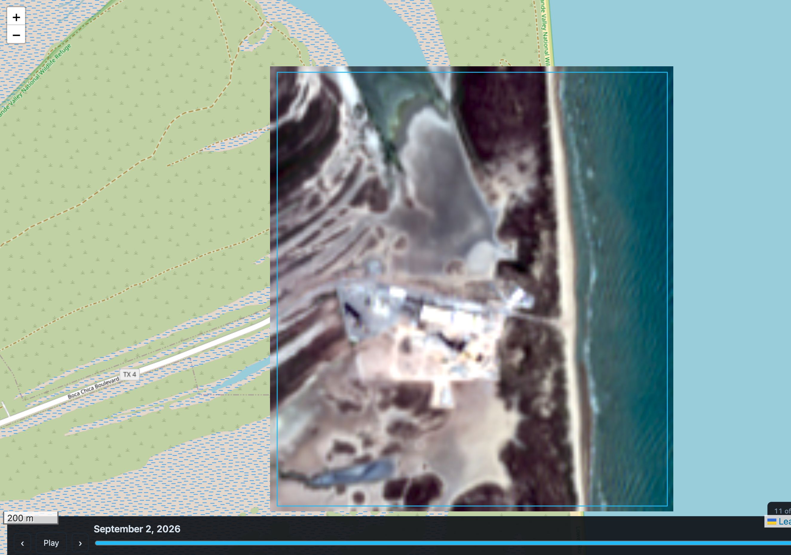
Try the browser preview — no install, no account. It runs the same change-point fit your desktop copy would, reads the imagery straight out of the archive, and never tells my server where you looked. The desktop tool is still the real one: it reads at native 10 m, keeps hundreds of dates, imports drone and Landsat rasters onto the same grid, and exports films with the changed regions drawn in.
One grid, or the whole thing wobbles
The obstacle to a timeline is not the imagery, it is registration.
The obvious approach warps each scene from its own bounds and coordinate system. That is fine for one picture and fatal for a sequence: scenes in a single stack routinely sit in different UTM zones, so every date lands on a slightly different transform, and the overlay visibly shifts as you scrub. Every apparent change near an edge is then a resampling artifact — a picture of the projection, not of the ground.
So the grid is computed once, from the area you drew, and every frame is warped into it. A pixel is sized to cover 10 m on the ground at the box's centre, which in Web Mercator is 10 / cos(lat) map units, and the footprint snaps outward to whole multiples of that native cell in absolute coordinates — not relative to your box. Two boxes over the same ground then share pixel edges, and a 5 m grid nests exactly inside the 10 m one instead of sitting half a cell off it.
Three things fall out for free. Every frame has identical bounds, so the browser swaps one image instead of juggling twenty. Pixel (i, j) is the same patch of ground in every frame, so comparing dates is arithmetic. And when your box straddles two granules, mosaicking them is just filling whichever pixels are still empty.
Colour, not brightness
Subtracting two optical scenes gives you a picture of the weather. Sun elevation and haze move every pixel between March and September by far more than most real change does.
The fix is to compare colour. Normalise each pixel's three bands to chromaticity and the overall gain divides out; the angle between two of those vectors — spectral angle — is invariant to any multiplicative change in illumination. Brightness is still reported, in its own channel, clearly marked as the untrustworthy one.
One detail that is not cosmetic. The textbook form of that angle is arccos(a·b / |a||b|), and in 32-bit floating point it is a trap: near zero angle the cosine sits at 1 − O(θ²), so a relative error of one float epsilon becomes an angle of about 0.03° out of nowhere. Comparing a frame with itself then reported a nonzero median shift, which quietly floored every "median change across this area" number the tool produced. The chord form, 2·arcsin(|u−v| / 2), is exact — identical inputs give exactly zero.
The threshold was measured, not chosen
Here is the part I would defend hardest, because the first three versions were all wrong and all of them looked fine.
For each pixel, the series of chromaticities over time is split at every possible date into a "before" and an "after", and the split that puts the greatest distance between the two means is taken as the moment it changed. That is the classic single change-point estimator, and it suits the subject: construction, a clear-cut, a reservoir filling, a runway laid — these are steps, not trends.
Then you need a floor, and the obvious floor is wrong.
Everywhere else the tool compares an angle against a model of sensor noise, which is correct for two dates. Here the statistic compares two means, and averaging two hundred frames a side shrinks sensor noise tenfold — so by that model a 1.2° step is overwhelming evidence. It is not. Sun angle, haze, soil moisture and phenology move a pixel far more than the sensor does, none of them are independent between frames, and none of them average away. The first run of this declared 96% of a stretch of Arizona desert "changed".
So don't model the spread. Measure it: each pixel gets its own observed scatter about its own mean colour, seasons and atmosphere included, scaled for the averaging at the winning split and for the fact that the reported step is the largest of a few hundred tries.
That still leaves a number to pick, and picking it by eye is how you get back to 96%. So it is measured too. Shuffle the dates and refit. Chronology is destroyed, every pixel's real spread of colours is preserved, so anything still flagged is a false alarm by construction. The gate sits where that rate goes to zero while the correctly ordered fit still finds its ground.
The browser preview has that as a button, which is the honest way to ship a claim like this — you can check it yourself instead of taking it from me. On a box over the Nashville stadium build it reported 0.015% flagged with the dates shuffled, against 0.81% in the real order, and no regions worth pointing at against three.
Some things that went wrong
Recorded because the errors are more useful than the successes.
A noise constant wrong by 1.53×. The floor used sqrt(2/3) = 1.155 where the Rayleigh derivation gives sqrt(π/2)·sqrt(2) = 1.772. It let 3% of a synthetic lake through a 3σ gate the mathematics says should pass 0.09%. When a threshold has a derivable distribution, derive it and then test against the derivation — a gate with a calibrated false-positive rate can be checked, one picked by feel cannot.
A caption that was confidently two years wrong. Three highlighted regions on Baracoa all read "Changed Sep 2021", and the largest had actually changed in May 2019. The per-pixel date already existed; the suggester was stamping every box with the busiest date in the whole scene, which is a different question. Nothing crashed, the captions were well-formed, the test suite was green, and the only way to catch it was to ask the data a question whose answer was known independently.
A hectare is ten thousand square metres. Not a hundred. That one put "17 m²" on a region that had changed over 1,700, stated to the reader as fact. Caught by noticing the areas were not multiples of the pixel size.
A box that was 86% of the frame. The first region-suggester took the bounding box of a connected component. Change in a real scene is scattered, so one component snaked across the whole picture. A region is a fixed-size window and the only question is where to put it — which a summed-area table answers for every position at once.
Filling the quota was the bug. Asked for three regions it returned three, however little was in the third — including one where 0.06% of the window had changed, magnified and captioned as though it were a finding. The floor is now anchored to the detector's own shuffled null, so a scene with only faint change returns fewer regions rather than three bad ones.
MP4 export failed on a machine where ffmpeg worked perfectly. A GUI launch inherits launchd's minimum PATH, which has no Homebrew in it, so the lookup returned nothing and every icon-launched export silently downgraded to Motion JPEG at six times the size. Reproduce from the launcher, not from your shell.
The browser preview, and what it leaves out
The preview at /timeline/ does the real work in your browser: it queries the public Sentinel-2 catalogue, byte-range reads the imagery out of the archive on AWS, warps it onto the same canonical grid, and fits the same change point. There is no proxy and there will not be one — a proxy would put every visitor's area of interest in a log, which is exactly the property this design exists to avoid.
It reads the 20 m overview and a couple of dozen dates by default, and that is a bandwidth decision rather than a quality one. A tile in these files is a fixed count of pixels, so it covers the same ground at every zoom level and simply costs four times more at each finer one — you pay for a whole 10 km tile even when your box is a tenth of it. Measured over a 2.5 km box: 219 MB at 10 m against 63 MB at 20 m, for detail a colour-based fit does not use.
Cloud is the other thing the preview had to learn from the desktop tool. Spreading dates evenly across the calendar and reading whatever lands there returned twelve totally clouded frames out of twenty-four, and the fit found nothing at all, because a cloud-masked pixel is a pixel with no look at the ground. The catalogue's own cloud figure cannot fix it — it describes a 110 km granule and is close to noise over a few square kilometres. So the preview reads the cloud mask at a coarse zoom first, measures what is clear over your box, and only then fetches full frames for the winners: 420 dates scanned for 4.9 MB.
Not in the preview: 10 m and 5 m detail, hundreds of dates, the eleven band combinations, the A-against-B swipe, GeoTIFF import from other sensors, radar, the spectral probe, batch runs from a CSV, and film export.
The arithmetic is not simplified, though, and that was checkable rather than assertable. Every stage of the browser version is checked against the desktop tool: the projection, the imagery reader (233,675 pixels, exact), the grid across 1,495 boxes, the warp, and the change fit across all 168,920 pixels of a test scene — exact, or it would not be up.

Comments